Monday, April 27, 2009

Nominal Area Choropleth Map


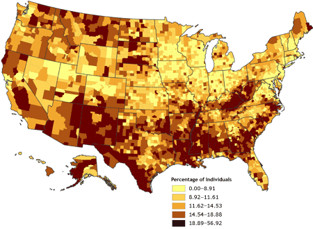
This is an example of a nominal area choropleth map. There is an apparent constant unit measuring areas and percentiles of condo owners that are African American.

http://my.ilstu.edu/~jrcarter/Geo204/Choro/Tom/calif-correct-4-quartiles%7B2%7D.gif

Similarity Matrix


This is a similarity matrix of congress and their voting. According to the data collected, this person concluded that republicans are more likely to vote alike and are more consistent on similar issues.

http://www.manifestdensity.net/2007/03/02/20070302_similarity_matrix_color.png

Star Plot


Star plots contain a lot of information in that each star plot represents a single observation with a number of different variables per that observation. I have given an image of a star plot of an analysis of automobiles from the year 1979. As mentioned on the website, they can be looked at individually or as clusters.

http://www.itl.nist.gov/div898/handbook/eda/section3/gif/starplot.gif

Lorenz Curve


This lorenz curve shows the population versus income and where equality rates compared to the two.

http://www.northlan.gov.uk/business+and+employment/local+economy/economic+information/lorenz+curve.jpg

Isopleth Map


This isopleth map shows the amount of acid rain in a given area.The Department of Environmental Protection of Pennsylvania made this map to show how the Clean Air Act affected the acid rainfall.

http://www.dep.state.pa.us/DEP/DEPUTATE/airwaste/aq/acidrain/images/isopleth_small.JPG

Isopach Map


In this isopach map, the amount of ash that has fallen to the ground measured. This map shows the ashfall deposit from 1992 as a result of the volcanic eruption of Cerro Negro.

http://www.volcano.si.edu/volcanoes/region14/nicarag/cerroneg/14neg05f.png

Isotach Map


Isotach Maps show wind speed and direction in a given area. One of the highest points of pressure in this map can be seen in Montana.

http://www.atmos.washington.edu/~mcmurdie/oct96/isotach_height_300.gif

Isobar Map


Isobar Maps show wind pressure, direction and speed. This is an example of an map and of the cold and warm fronts that are moving toward Europe on September 25, 2008.

http://www.windfinder.com/news/did_you_know_images/isobars_central_europe_1.gif

Propaganda Map


This is an example of a propaganda map. The sizes of certain things are misconstrued to show power or make a point. Often these are used in times of war.

http://www.newberry.org/smith/slidesets/images/vs1_3_tn.jpg

Standardized Choropleth Map


This is an example of a standardized choropleth map. The different colors in the map are categorized by severity, and is therefore ranked and not random.

http://www.cdc.gov/PCD/issues/2007/oct/images/07_0091_02.gif

Unstandardized Chloropleth Map


This is an example of an unstandardized chloropleth map. As you can see, there is no specific ranking or ordering in the separations of minorities/race. It just simply shows the different types in different regions.

https://courseware.e-education.psu.edu/courses/geog482/graphics/citationexample.jpg

Bilateral Graph


A bilateral graph shows two related variables and the points at which they overlap. In this case, The United States Treasury Department looked at jobs versus unemployment rates over the time-span of January 2003 to November 2005.

http://www.treas.gov/press/releases/images/november%20jobs%20graph.jpg

Index Value Plot


This is an image of an index value plot. It is has several different dimensions to show differences and is plotted on a line graph.

http://www.techmind.org/blog/ftas_value_by_date.gif

Scatter Plot


This is an image of a scatter plot used by the United States Army. It plots the numbers of SATs versus the Beta test. Scatter plots are similar to line graphs, but can show up to four dimensions rather than just one.

http://www.army.mil/ArmyBTKC/i/focus/cpi_tools_13_S.gif

Population Profile/Pyramid


Population profiles/pyramids show trends in statistical information regarding population over a number of years. This population profile shows the number of people that have AIDS according to gender and age.

http://www.ifad.org/operations/regional/pf/figure1.gif

Climograph


Climographs are used to show two different variables. It consists of a bar graph representing the amount of precipitation and a line graph for the temperature. In this particular graph, we are looking at the temperature and precipitation of Beunos Aires, Argentina over a year.

http://www.uwsp.edu/gEo/faculty/lemke/geog101/images/09_climograph_Cfa.gif

Parallel Coordinate Graph


This is an image of a parallel coordinate graph. They are used to plot large amounts of data. In this one, each variable corresponds with an axis and different colors are used to emphasize the information.

http://www-vis.lbl.gov/Events/SC07/Drosophila/3DParallelCoordinates.png

Mental Maps


This is an example of a mental map. Mental maps can be anything from sophisticated and detailed, to just a little swirl on a page. This person chose to portray a map to get to school. As you can see there are sidewalks, houses, names of a few streets, and the location of the school.

http://soa.utexas.edu/work/eaejp/Methods/Mental%20map%20from%206th%20grade-f.jpg

Thursday, April 23, 2009

Cartogram


Cartograms are maps that are distorted so that the information represented demonstrates the point that is being made.

http://agro.biodiver.se/wp-content/uploads/2007/03/singer-cartogram.gif

Flow Chart


Flow maps are used to show movement of an object, person, or idea from one place to another. It is an algorithym or process used in designing or portraying information. Although somewhat silly, I added this flow chart of the Hokey Pokey. I thought it was funny to see among serious flow charts! However, it does show the process of movement.

http://brighthaven.files.wordpress.com/2008/06/funny-graphs-hokey-pokey-flow-chart.gif

DLG


Digital line graphs (DLG) are digital vector data representing cartographic information. They provide a wide variety of information and geographic features. This can include political or administrative boundaries, vegetation, transportation data, land survey systems, hudrography, etc.

http://pubs.usgs.gov/of/2003/of03-471/graphics/domier/fig2.jpg

DRG


A digital raster graphic map (DRG) is a type of topographical USGS (United States geographical survey). This DRG map is from the Texas Comission of Environmental Quality.

http://www.tceq.state.tx.us/assets/public/gis/images/drg.gif

DEM


A digitial elevation model (DEM) is used to show terrain and elevations among at certain ground positions and regularly spaced intervals. They are digital cartographic data in raster form. This image is of Crater Lake National Forest.

http://oregonexplorer.info/craterlake/images/4ds/dem_index.gif

Black and White Aerial Photo


This is a black and white aerial photo of Johnstown, Pennsylvania in the 1950s.

http://www.jaha.org/edu/flood/rebuild/img/panoramas/550w/JT_aerial-1950s-550.jpg

Infrared Aerial Photo


This is an image of an infrared aerial photograph of Paramaribo, Suriname, South America. It will be used for economic development.

http://www.fugroearthdata.com/images/projects/c-projectssubcat_48.jpg

Doppler Radar


Doppler Radar is satellite imaging used in weather forecasts. It shows precipitation type and rainfall intensities. This is a doppler radar image of Hurricane Andrew August 24, 1992.

http://www.ultimatechase.com/Chase_Accounts/Images/Hurricane_Andrew/Close_Up_Radar_Still.jpg

LIDAR

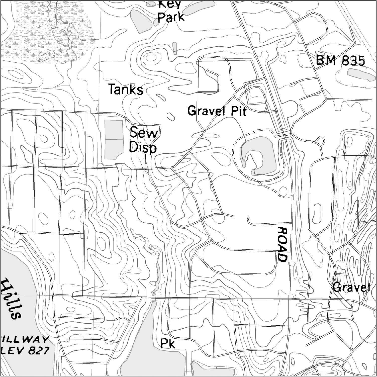
LIDAR stands for light detection and ranging technique. It is also known as 3-D laser scanning. This is a LIDAR image collected after a 2007 lanslide.

http://soundwaves.usgs.gov/2007/06/LidarExampleLG.jpg

Triangular Plot


Triangular plots are often used by scientists and engineers, but anyone can use them to show usually three variables (but can be more variables) of data graphically. This triangular plot is an analysis of votes in the UK. The different variables in this case, are the different parties in the upcoming election.

http://ex-parrot.com/~chris/images/20050407/triangle.png

Windrose


A windrose is a graph to show wind speed and direction and is typically circluar. I provided two different types of windroses to show how different they can look.

http://windrose.org/windrose.jpg
http://www.climate.washington.edu/windrose/Seattle-WindRose.jpg

Pie Chart


Pie charts are an easy way to graph and visually comprehend information. This is a pie chart of different materials/items found in recycling bins.

http://www.wirral.gov.uk/Images/Open/migration/BE/regular/PieChart.gif

Stem and Leaf Plot


Stem and leaf plots are a way to analyze data by creating a number graph that proves a certain set of data. They use numbers to produce values.

http://www.learner.org/courses/learningmath/data/images/session3/3d3_solution.gif

Histogram


A histogram is a statistical graph or map portrayed graphically with bars that can be shown horizontally or vertically. This particular graph is of the number of smokers female and male in 1992.

Isohyet


An isohyet is a type of contour or topographical map showing the amount of rainfall, usually by inches. This map was taken from the University of Texas and shows the amount of rainfall in a given amount of time.

http://www.lib.utexas.edu/geo/balcones_escarpment/images/p6fig4.gif

Proportional Circle Map


A proportional circle map is a point pattern map with circles rather than dots. The size of the circle relates to the measured variable. This proportional circle map shows the number of people in Europe that used the internet in the year 2004.

http://www.geog.ucsb.edu/~jeff/gis/proportional_symbols_files/map1.jpg

Correlation Matrix


A correlation matrix is a rectangular array of numbers that gives the correlations between all data sets. In this correlation matrix, the information shown is a heat map of tissues to tissue cancerous cells. The lines separate cancerous tissues, and the color spectrum goes from blue to white to red.

http://www.livestockgenomics.csiro.au/Genome_to_Phenome/matrix_corr_gt1SD.png

Saturday, January 24, 2009

DOQQ


Digital orthoimagery quarter quadrangle is a computer generated image of an aerial photograph. They can be in black and white, natural color, or infrared. This DOQQ is an image of a portion of Washington, DC.

http://seamless.usgs.gov/website/seamless/products/1mdoqq.jpg

Friday, January 23, 2009

Box Plot


A box plot is a way of distributing numerical data graphically. This example is of biometric scores in June of 2005.

http://www.epa.gov/volunteer/stream/images/fig64.jpg

Bathymetric Map


A bathymetric map is a type of topographic or contour map that shows sea floor elevations. This is a map of the floor of the Gulf of Mexico.

http://celebrating200years.noaa.gov/events/survey/gulf_of_mexico650.jpg

Topographic Map


I think this is a very interesting map. It shows the earth as a living organism with the greenery. This is a topographical satellite map.

http://worldmapsonline.com/SatPosters/LivingEarth.jpg

Tuesday, January 13, 2009

Dot Density/Distribution Map


http://cartophilia.com/blog/images/popdensity.jpg

Dot density maps are a type of point pattern map. It is a nonproportional point symbol that does not vary in size. One dot represents 10,000 people. This particular dot distribution map is used to show the populations in the United States in the year 2000.

Sunday, January 11, 2009

yay i figured this out

I still have to post my first map. I'm just glad I figured this thing out :o)